How to create an easy-to-update chart using PivotTables / PivotChart from data combined by Power Query

This article will show you how to create a chart showing the total amount of each group after combining multiple Excel books with Power Query.
Excel books used in this tutorial
The Excel Book to be used this time is an Excel Book that combines three Excel books with Power Query.
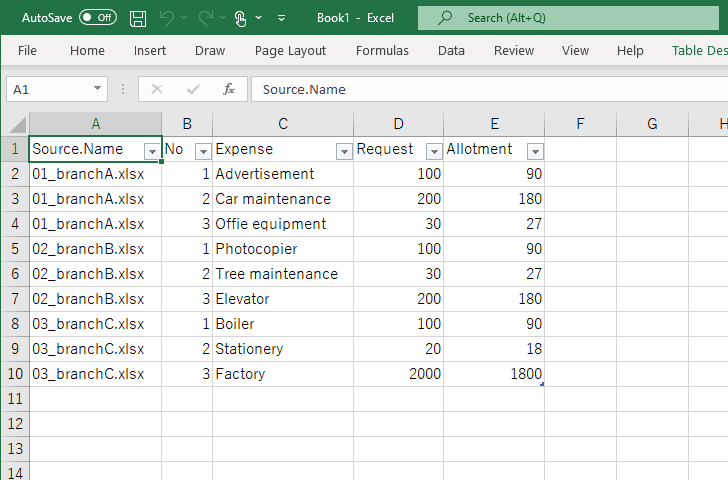
This is an Excel book created in the tutorial introduced in the following article, so please read this first.

How to combine multiple excel books into one using Power Query and split it again using VBA
If you are sick and tired of wasting time with cut-and-paste to merge or split excel data, this article is for you.
First, since there are no subtotal amounts for each branch in the data, let’s make a table with subtotal rows.
How to create a table with subtotal rows with PivotTable
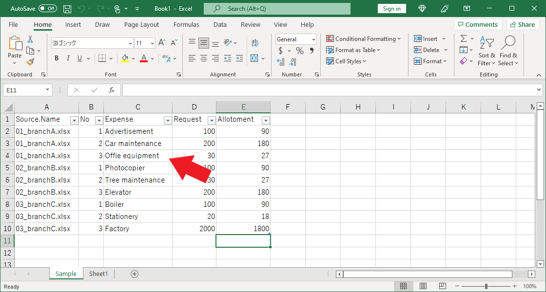
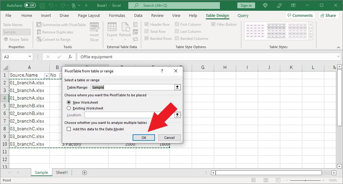
Click one of the cells that contains data.
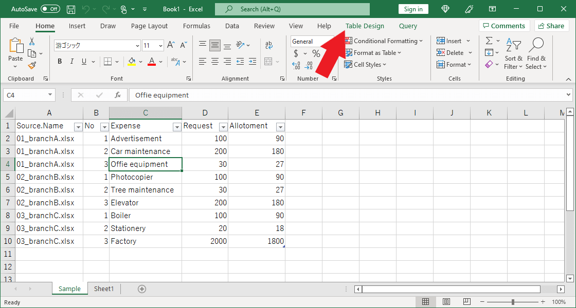
“Table Design” and “Query” will appear at the right end of the tab. Click “Table Design.”
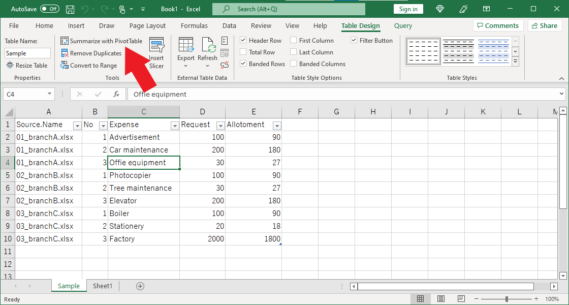
From the Table Design menu, click on “Summarize with PivotTable”.
“PivotTable from table or range” window will appear. Leave the options unchanged and click OK.
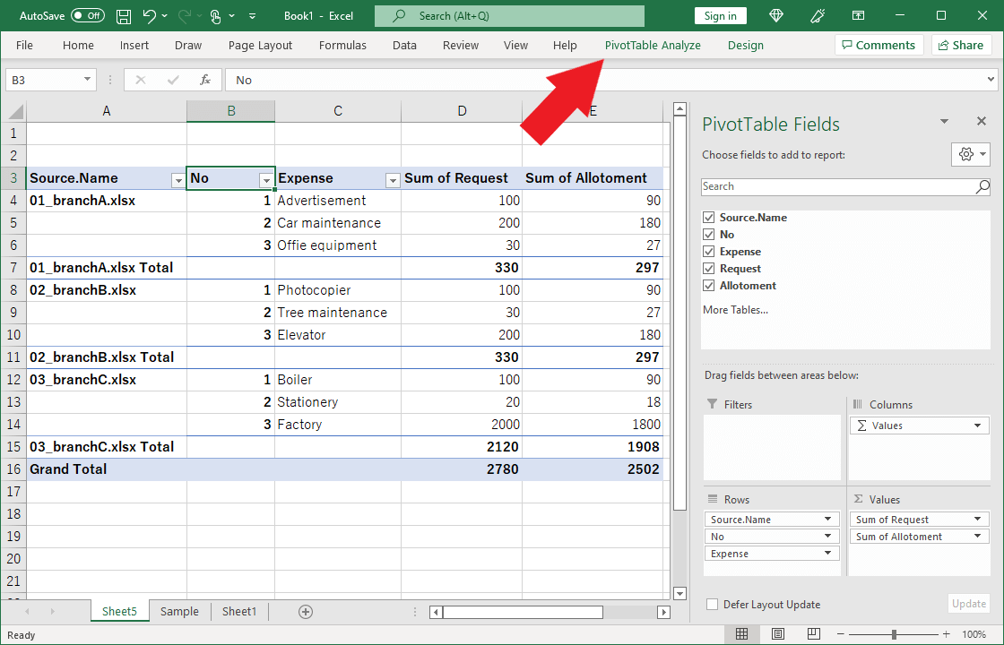
A new worksheet is created, and a panel called PivotTable Fields appears on the right side of the screen. Check all items near the center in order from top to bottom.
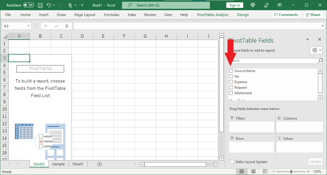
The checked items appear in “Columns”, “Rows” and “Values” at the bottom of the panel.
“No” is in column B, but the sum has been calculated, so let’s correct it. Drag and drop “Sum of No” from “Value” to “Row.”
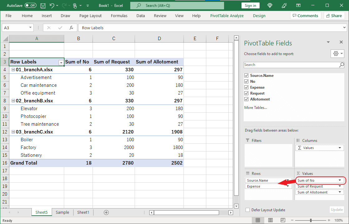
The “Sum of No” in column B moves into column A, and “No” and “Expense” are displayed in two separate rows. (e.g., rows 5 and 6)
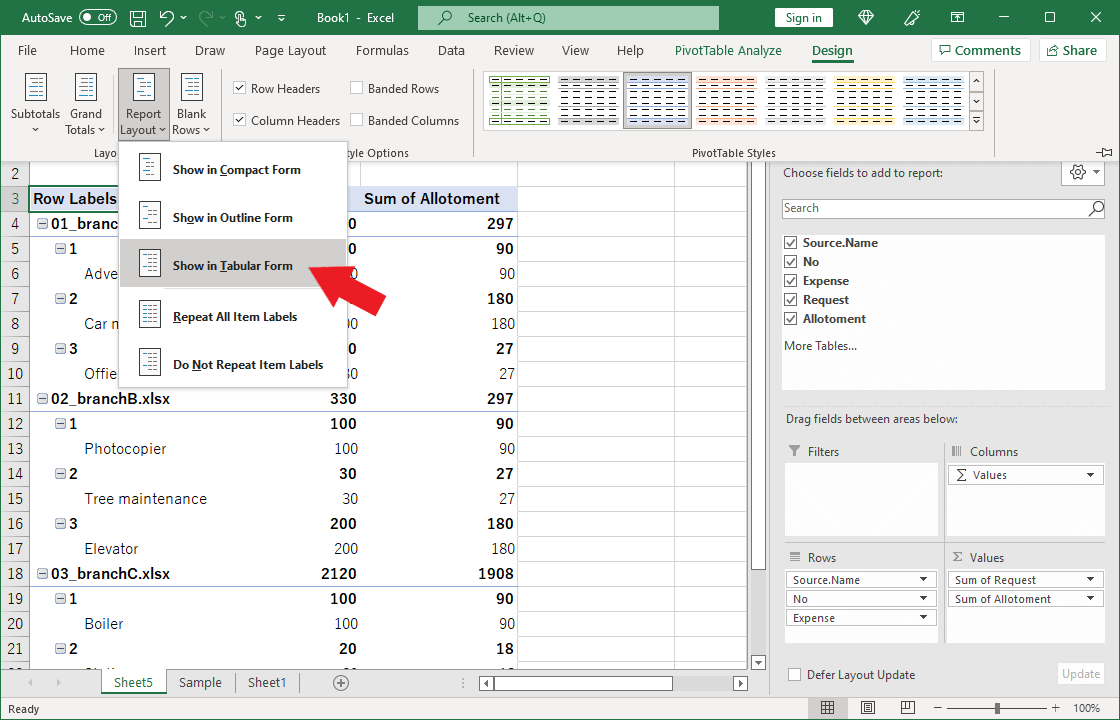
Let’s fix this. Click the tab “Design.”
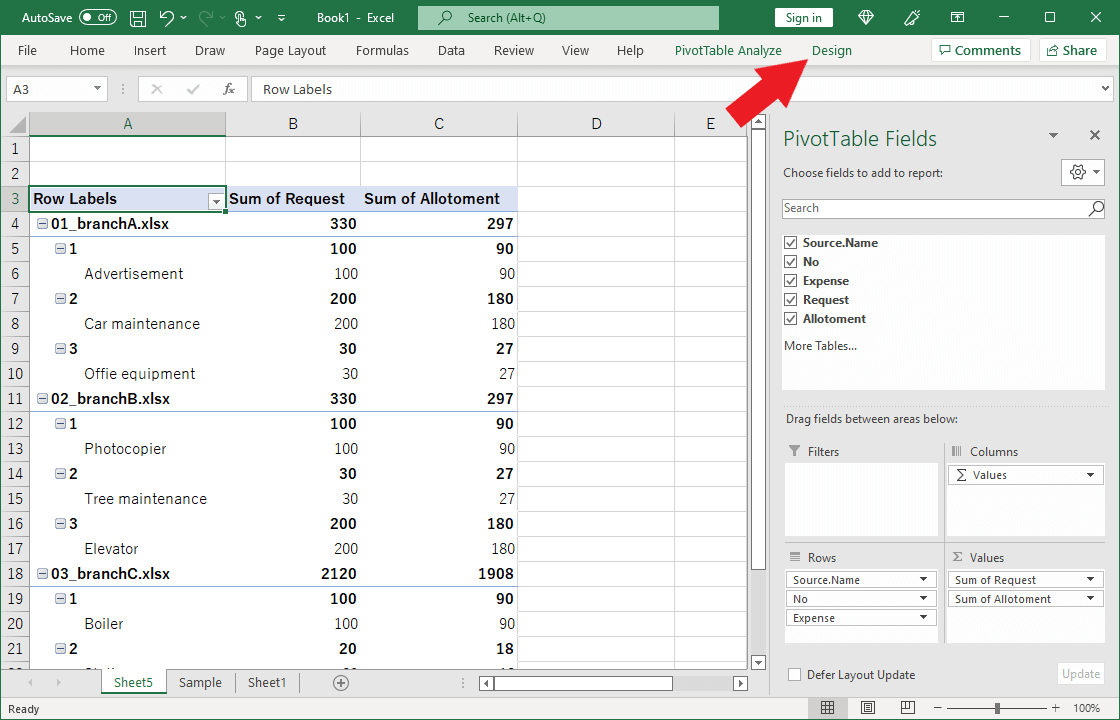
From the tab “Design” menu, click on “Show in Tabular Form” from the “Report Layout” pull-down menu.
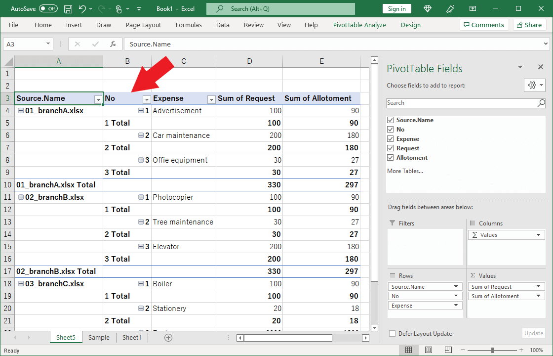
The “No” and “Expense” in column A have been moved to columns B and C, respectively, but are still in two rows. (e.g., rows 6 and 7)
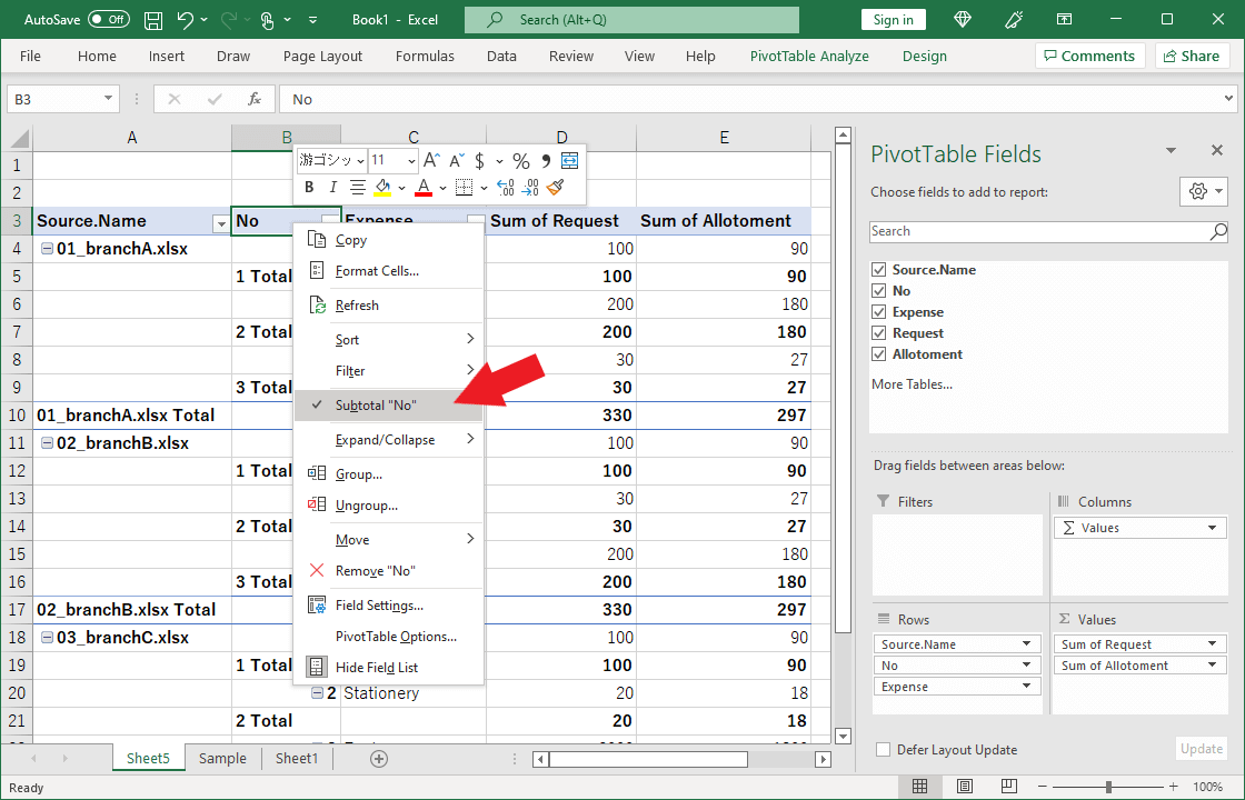
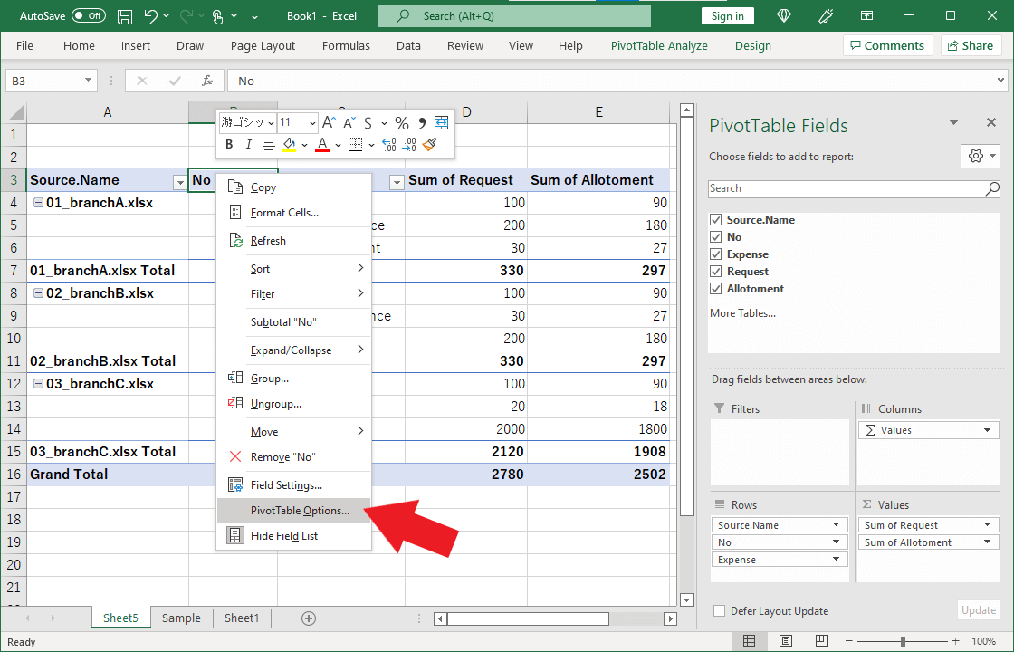
Select cell B3 and right-click.
Uncheck Subtotal “No.”
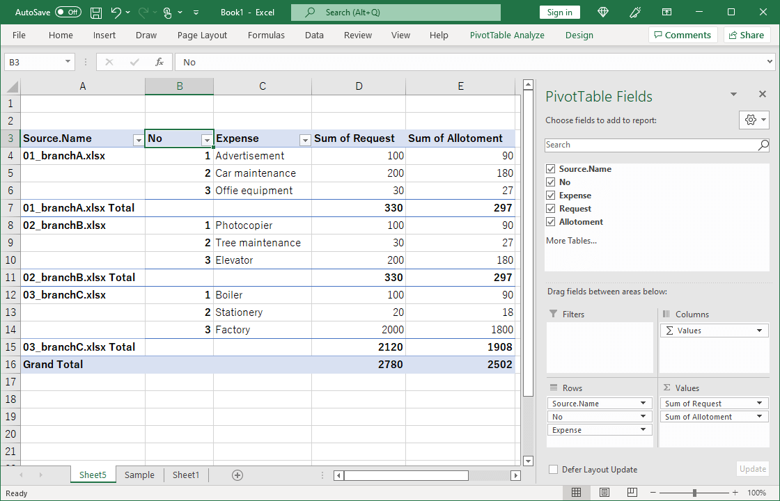
The problem of two rows for “No” and “Expense” has been resolved.
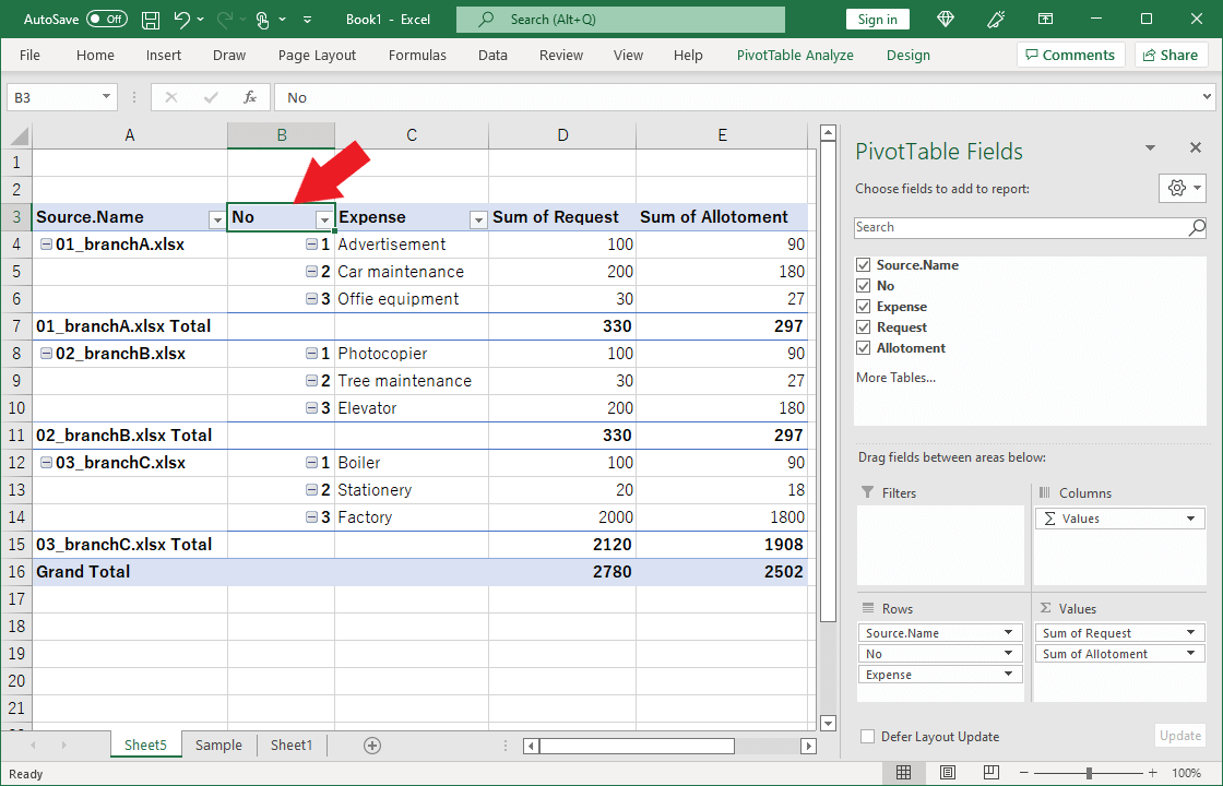
The “-“ buttons have been displayed in cells such as A4 and B4, so let’s hide them.
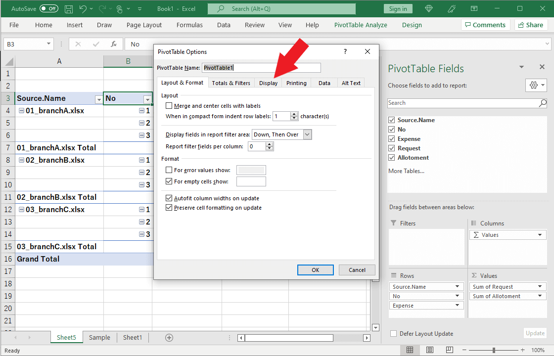
Right-click in cell B4 and click “PivotTable Options.”
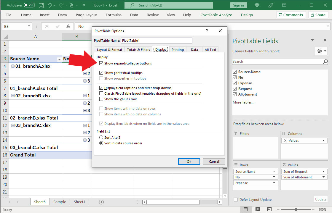
Click on the tab “View.”
Uncheck “Show expand/collapse buttons.”
Well done.
How to create a column chart with PivotChart
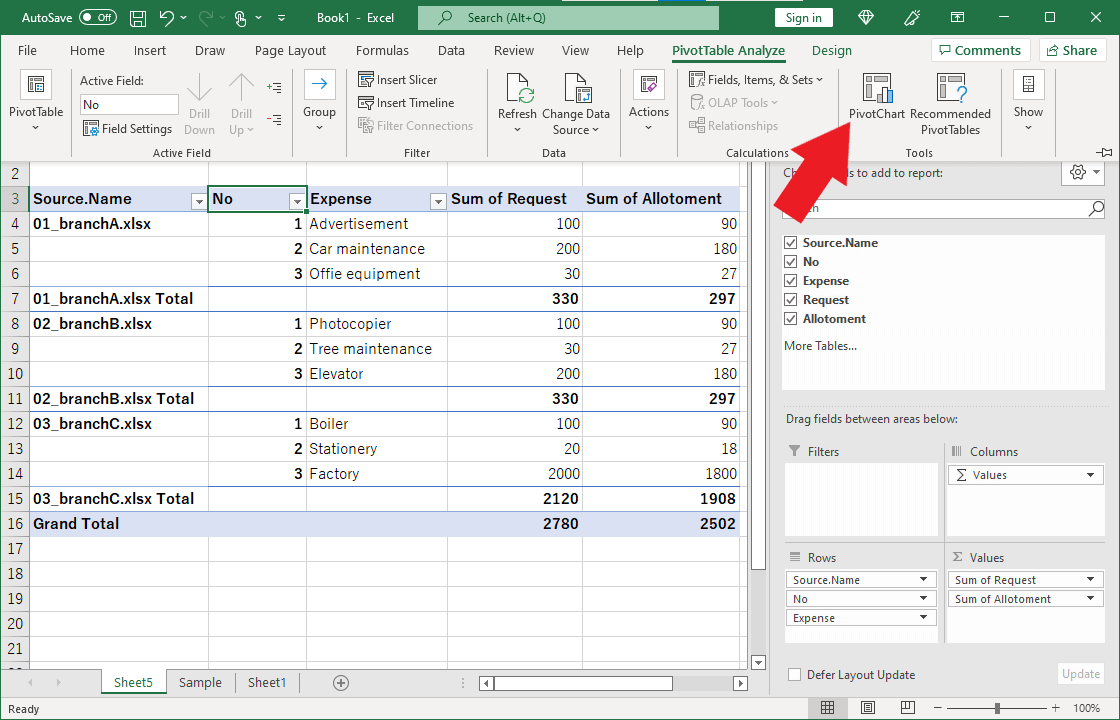
Next, let’s create a chart that is easier to understand visually.
Click on the tab “PivotTable Analyze.”
In the menu, click PivotChart.
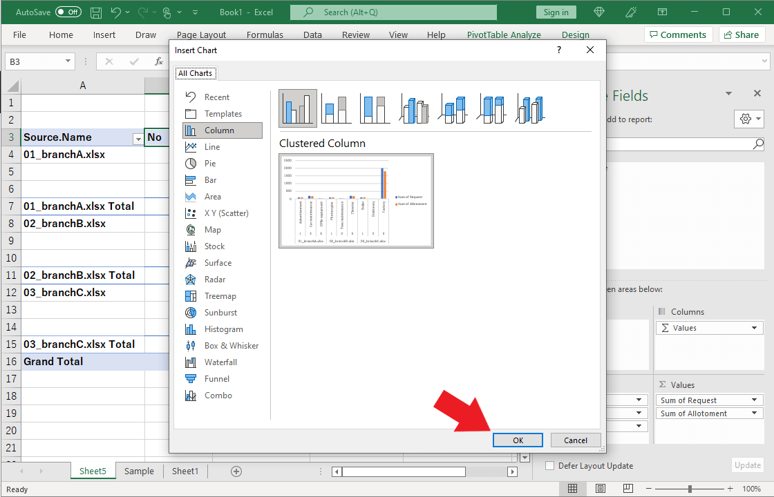
Select “Clustered Column” and click “OK.
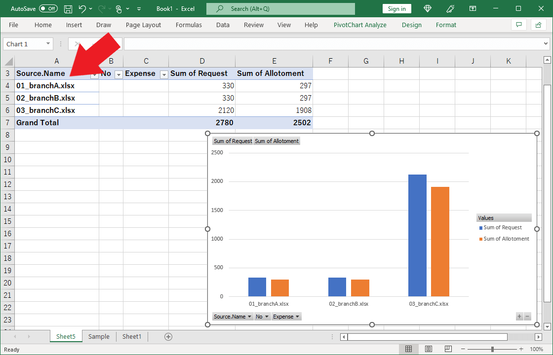
A chart will appear. To show only the total amount for each branch, click the “-“ button “twice” in the lower right corner of the graph.
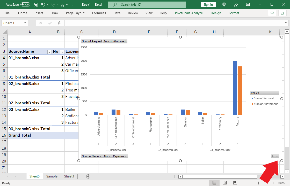
The chart has changed to the total amount for each branch.
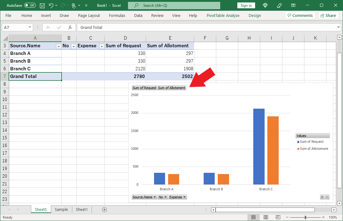
Rewrite cells A4 to A6 to make the chart headings only the branch name.
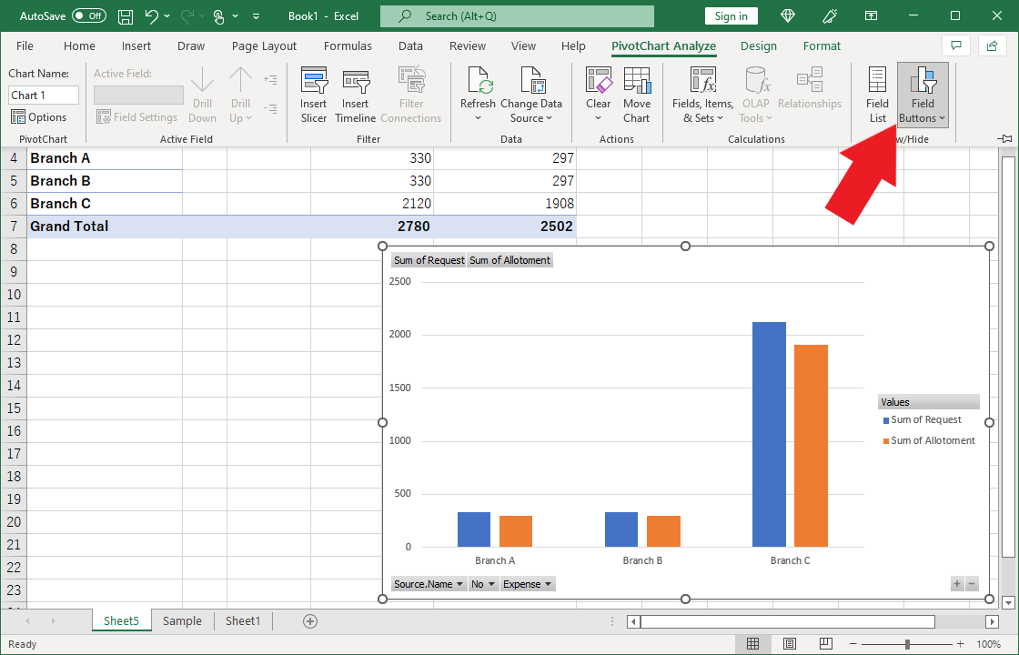
Let’s hide the buttons on the chart.
Click the chart.
Click on the “Field Buttons” in the menu.
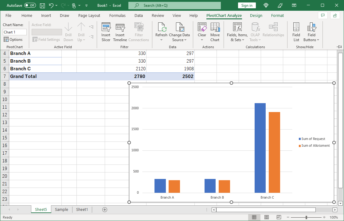
The buttons on the chart are now hidden.
The following article describes how to replace or add data to the source data to be combined in Power Query.

How to replace, add, or delete data after combining Excel books in Power Query
This section explains how to replace, add, or delete Excel books that are the source of the combination after Excel books have been combined using Power Query.